Apple has announced that it will hold its annual Worldwide Developers Conference (WWDC) online on June 22nd. At the event, the company is expected to release new software for its hardware lineup—both upcoming and existing. Although, as always, people are more excited about updates to iOS and iPadOS (new) than about anything else.
This year, Apple is bound to announce the 14th iteration of iOS. It feels surprising that we’ve arrived at this point. 14 years of improvements feel nothing short of achievement and there is a lot to think about how much we might have left behind or simply carried along the way.
The iOS keyboard, for example, has managed to stick with us for a long time, having brought about minor changes and improvements here and there while some things like the dedicated Game Center app and native social media integration couldn’t survive.
The more you chase perfection, the more you tend to overlook simpler stuff
Albeit, as much as I’d like to appreciate the efforts Apple puts into refining its operating system day in and day out for the iPhone and iPad, there are yet some things that I think a company known for its sheer power could improve in iOS 14 coming from iOS 13.
Before we begin, it’s worth noting that based on 9To5Mac’s extensive and elaborate iOS 14 leaks, we already have an outline of the features that the next iPhone operating system is set to introduce. There’s a chance they might be all Apple has planned for now and it’s too late to make any suggestions; nevertheless, it’s worth a shot.
As much as I love using my iPhone, I increasingly feel that iOS needs to fix stuff before introducing anything new. As a result of that notion, I’ve created a list of flaws that iOS 14 could eliminate or rather improve. It’s important to note that this is not an iOS 14 wishlist for new features, but a plea for enhancing the little things that are already existent on iOS.
If not in iOS 14, I hope Apple considers these suggestions—which I think are popular opinion—for future iterations.
The more you chase perfection, the more you tend to overlook simpler stuff. What Apple has been doing for the past few years is that it’s chasing perfection while getting the fundamentals wrong. I may get a bit nitpicky here, but these are all the things that have been annoying me on iOS for some time. And I am sure most of the suggestions on this list will resonate with a lot of you guys as well.
Here are some things that I feel could be fixed or improved in iOS 14.
In no particular order…
Calls take up the whole screen
This is quite a ubiquitous complaint in the iOS community. People have been demanding Apple to include this feature for a long time now. Currently, up to iOS 13, when someone calls you, the calling interface takes up the whole screen and doesn’t allow you to do anything else until the call ends or you manually reject it. That way, it gets both very limiting and annoying when an unwanted call appears while you’re doing something important. This is also increasingly becoming a problem due to robocalls.
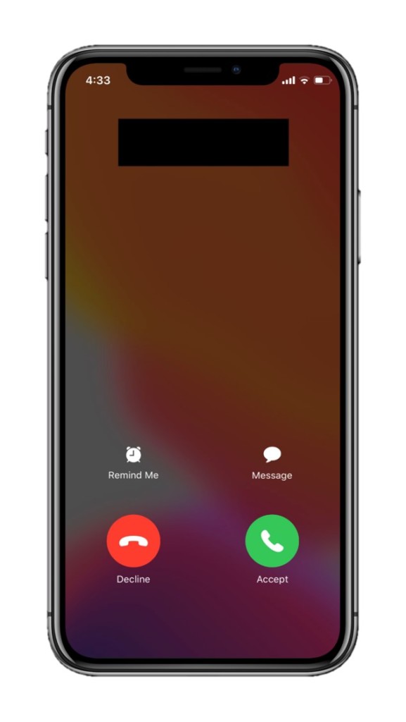
Apple should offer calls as banner notifications with options to accept or reject. This way, they won’t take up the whole screen and distract you from whatever you’re doing on the phone. Additionally, they could also prove to be a potential weapon against robocalls.
Craig Federighi, Apple’s Senior VP of Software Engineering responded to a Reddit user’s email who requested this change by saying “We cannot make this change in iOS 13, but we’ll certainly keep it in mind for the future.” A classic Craig!
This could point towards something solid, but the lack of an adequate amount of rumors coupled with waning discussion on the topic has lead me to believe that the feature is unlikely to be launched with iOS 14. However, there’s very little harm in keeping your hopes up.
Android has had this feature for a long time, moreover. And for our friends there, it’s nothing less than a blessing. It’s time for iOS to copy Android for a change.
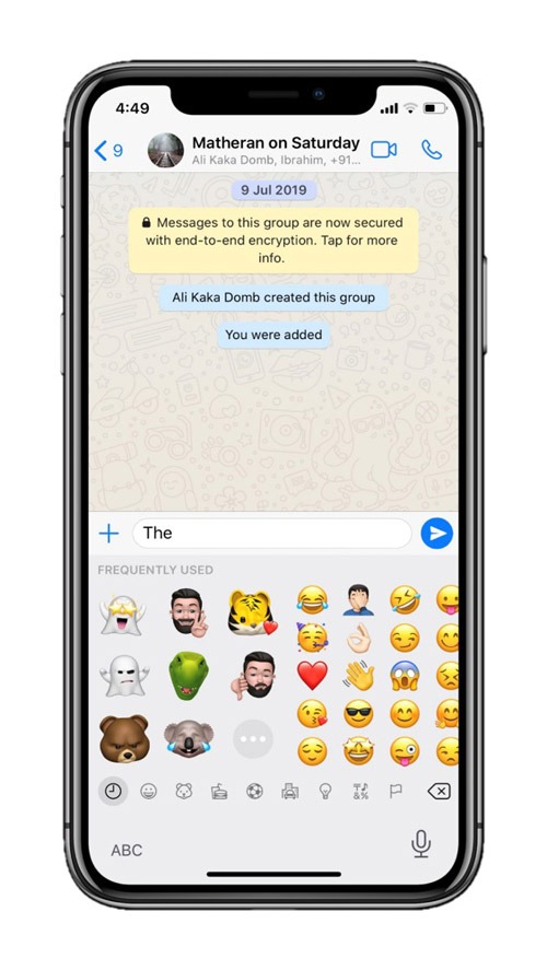
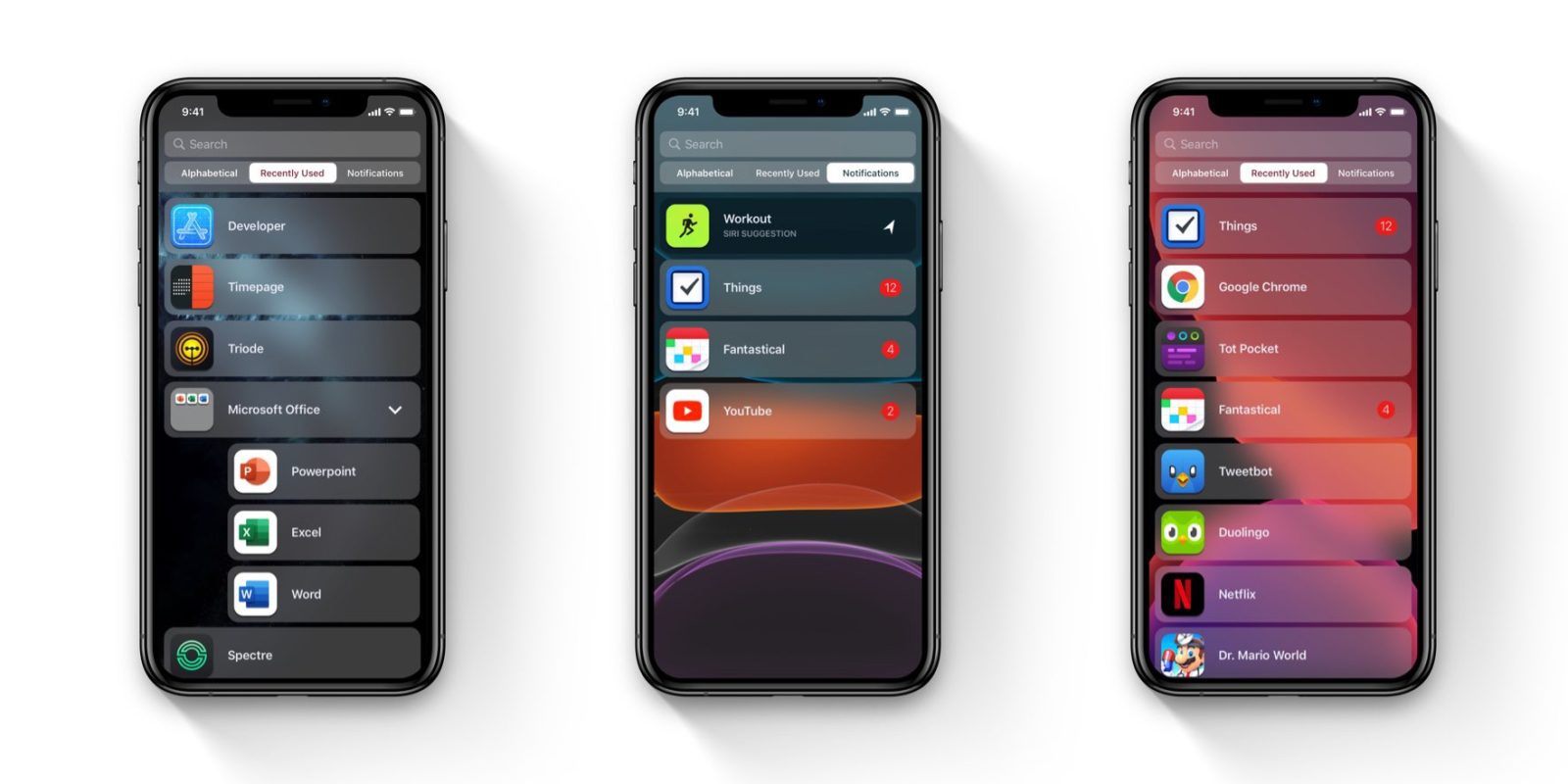
Notifications are a mess
I remember using my iPhone 6 on iOS 9. And I absolutely adored the way notifications were offered to me, even though there was no grouping back then. The introduction of redesigned notifications in iOS 10 altered my perception a bit. Then, unfortunately, the launch of iOS 12 outright obliterated that sentiment.
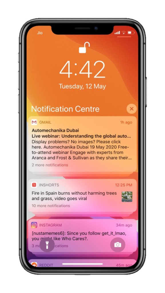
iOS 12 brought notification grouping, which everyone appreciated. But those were offered in the design language of iOS 10, and still are offered that way. There’s nothing logically wrong in the current notification system. And most people will find this suggestion irrelevant, but since they are influenced a lot by iOS 10’s design language, I feel that notifications in iOS 13 are clunky and quite overwhelming. They are a visual mess. I personally know a lot of people that have a similar opinion.
Naturally, grouped notifications are stacked above one another, and tapping on a group reveals other notifications in the group. The whole “revealing the notifications” experience seems displeasing to interact with. Moreover, the notification which leads a group shows too much information at once, making it a bit overwhelming to contemplate. What’s more, on older iPhones, the clunkiness of grouped notifications induces lag.
Apple could follow a simpler approach with notifications, instead. A jailbreak tweak exists that offers a unique solution to this problem. It groups notifications in tabs that can be accessed by tapping the app icons associated with the notifications like this:
Don’t get me wrong, though. Notifications on iOS are functionally great after a long time now. You can manage whether you want a certain notification delivered silently or outright disable it. It’s the interface helping access such functionality that’s weird.
Bring emoji search functionality to the keyboard
Emojis are an interesting way to converse with your friends, family, and colleagues. So, this goes without saying that they are used quite frequently using the iOS keyboard. However, despite having predictive emoji that works similarly as emoji search, it’s still very inconvenient due to the fact that it only works when you enter the words precisely predefined by Apple.
For instance, on iOS’ keyboard, if I type in “dance,” the keyboard will only suggest a dancing woman wearing a frock. In order to let the keyboard suggest a dancing man too, I will have to type in “dancing,” which has no connection to the gender of the dancer whatsoever. It’s these kinds of irregularities that could bar you from using emojis to their full potential. Plus, it kinda gets annoying after a while.
To fix this, Apple should add a simple search function in the stock keyboard itself that shows relevant emojis based on the search text. Various third-party keyboards already have this functionality. And you may ask: Why bother when third-party keyboards with such functionality already exist? Let’s just say that no other keyboard matches the fluidity and the simplicity that iOS’ keyboard offers out of the box.
Hence, the implementation of this feature could make a world’s difference for emoji addicts like me. If not, it could simply make using my iPhone’s keyboard more pleasing.
Phone number suggestions in the dialer
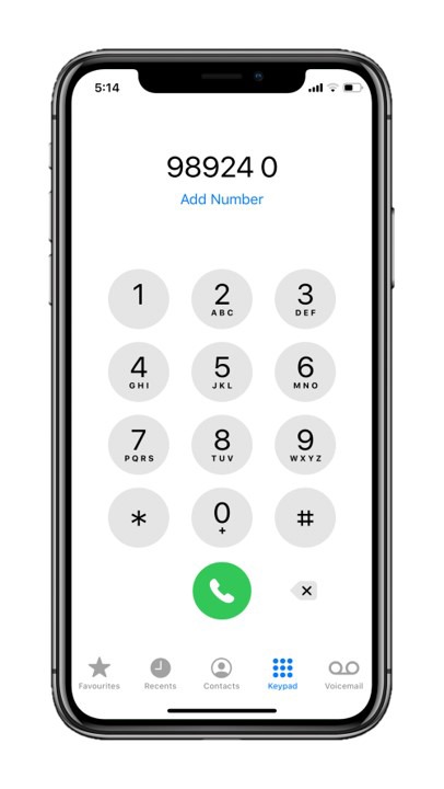
iOS’s dialer is great. It’s simple and straightforward. However, it lacks a pretty convenient feature that Android phones have had for a long time—contact suggestions in the dialer.
Naturally, on iPhone, when you are in the process of typing a phone number in the dialer, it doesn’t suggest relevant contacts until after you finish typing the entire number. This process can be a lot faster if Apple implements contact suggestions while typing so that you can tap on a contact to automatically enter the number before you finish typing, thereby saving you both time and frustration.
This suggestion has been making rounds in the iOS community for a long time now. But I still feel it needs to get more traction for Apple to consider it paramount.
Better color indication for Private Browsing mode in Safari
While browsing in Safari using its in-built private mode (incognito for Safari), the only way you can distinguish if you’re browsing in private mode or regularly is the darker URL bar and a tiny “Private” label in Private Mode.
Even though Private Mode displays a label in a new tab saying that you’re browsing incognito, that label doesn’t convert into anything while browsing a page. You can see the difference between private browsing and regular browsing in Safari on iOS below. But the difference isn’t adequate, especially when system-wide dark mode is enabled.
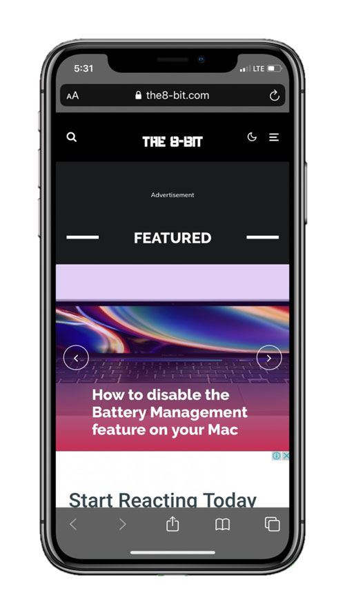
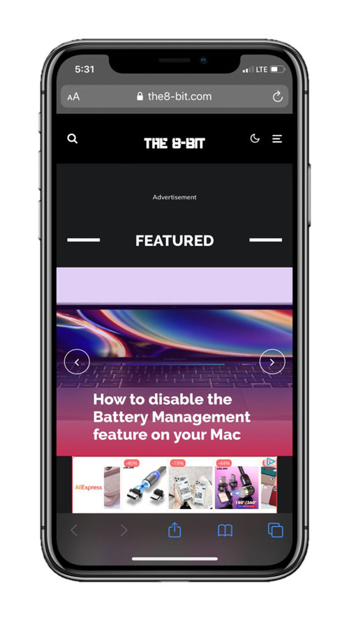
I am putting a lot of emphasis on this shortcoming because it matters in which mode you browse. Private Mode does not save cookies, browsing history, and website cache; which could make a website load slower in comparison to regular mode. So, it becomes problematic if you are on a website that’s important to you.
There’s also the possibility of losing a great website that you’d been to but couldn’t find it in your browsing history. Thus, if you accidentally continue browsing in Private Mode, the lack of enough visual cues could cause inconvenience.
I might be nitpicking at this point, and not a lot of people might agree, but this is one of the things I think Apple can easily improve.
Use favicons in the history tab in Safari
Inspired by Chrome’s history tab, I think Safari’s history tab also needs to add favicons to website listings to increase readability. Currently, that space seems lifeless owing to your browsing history being placed in a linear list of websites that you visited in the past. And this thought could further intensify for those who might have visited a lot of websites.
Personally, I do not find myself accessing the history tab often. This may be because I see Safari as a quick way to Google things much rather than spend quality time browsing websites. For that, I use a less-portable device.
For those who don’t know, favicons are essentially website logos. Even Google SERPs (Search Engine Result Pages) started displaying favicons for some time before they unexpectedly removed them. Since they are practically images, they serve the memory better as compared to plain text.
Video quality controls in the camera app should be easier to access.
Apple has improved the default camera app to a great extent. It’s far developed from what it was a few years ago. One of the welcome features include the addition of video quality controls right in the camera app.
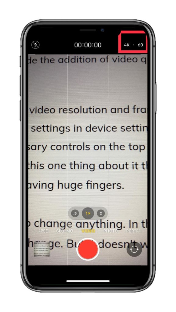
For some reason, Apple didn’t initially let people change the video resolution and framerate from the camera app. They’d have to go to the camera tab in device settings to do that. However, now that iOS 13 has introduced the necessary controls on the top right corner in the video capturing interface of the camera app, there’s this one thing about it that bugs me and evidently a lot of other people too; especially those having huge fingers.
And it’s that the controls are so small that it takes multiple taps to change anything. In theory, you’d just tap on the resolution and framerate controls and they’d change. But it doesn’t work as effectively in practice.
A simple fix is to increase the size of the video controls (which also act as indicators). This isn’t something that needs to be fixed. But it would be a lot easier to switch between different video resolutions and framerates if Apple considers this.
Instant push notifications in the stock mail app
iOS’s stock mail app is aesthetically pleasing. It retains proper inter-device functionality as well what with the quick response actions on the Apple Watch. If only it had this feature that all mail apps should have, I would clearly use it as my primary mail companion.
Currently—and this has been the case for years—the stock iOS Mail app doesn’t support instant mail push notifications for Google emails. It has to refresh based on a schedule or manually do so in order to fetch new mail. It’s pretty limiting considering it’s an email app prevalent on iPhones and iPads in 2020 and as most of us use Google’s email services. As a result, many prefer Google’s own Gmail—a third-party email client for their email needs.
However, there’s very little Apple can do for this since Gmail doesn’t use EAS (Exchange Active Sync) which is the service used by email providers to facilitate push notifications. The only way we can get push notifications for Google emails in the iOS mail app is if Google uses EAS for regular accounts instead of just for its G-Suite accounts using Google Sync.
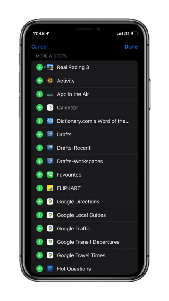
Add widget previews in the widget editing screen
iOS has a dedicated widgets panel when you swipe right from on your home screen. It offers quick access to functions from different apps. And it’s quite a convenient feature to have on an iPhone.
Moreover, adding or editing the widgets interface is easy as well. The widgets are named after the corresponding app’s functions and are presented in a list with a “plus” and a “minus” button allowing you to add them or remove them from the widgets interface respectively. But there’s a minor design improvement that Apple could do to make adding widgets easier.
Putting the issue in perspective, you would think to add a Google Keep (a note-taking app from Google) widget—judging from the listing in the edit widgets panel—means that it would show your recent notes. Instead, the widget only offers quick-access buttons to create a new note in different ways.
This gets confusing and intimidating with every app if you don’t know what the widget does beforehand. That way, the only option is to add the widget first and disable it later if it does not meet your requirements.
An easy way to get around that is by offering visual examples what the widget would look like after being added to the widgets panel, right in the widget editing interface.
Allow customizable widgets
According to rumors, Apple may already be working to bring widgets to iOS’ home screen on the iPhone just like it did in iPadOS. Those widgets could get much better if Apple allows customizing them.
Even if Apple does not launch widgets on iOS’ home screen, it would still be a neat feature to include in the existing widgets interface. For instance, the Apple News widget could prove more useful if you could manage the number of headlines displayed on it and how they are displayed—that is, in a card format or a list format, for example.
Display home screen icons in a list
This is a feature a lot of us have been asking. And this is already a wish come true as internal iOS 14 code scoured by 9To5Mac has revealed that iOS 14 may come with a refreshed home screen by offering icons in a list view.
Android phones already have it. And those who don’t can acquire it by downloading a launcher that supports the list view from the Play Store. It’s a major convenience to have icons alphabetically sorted in a list, thereby making it easier for users to access them.
Introduce an easier interface for setting alarms
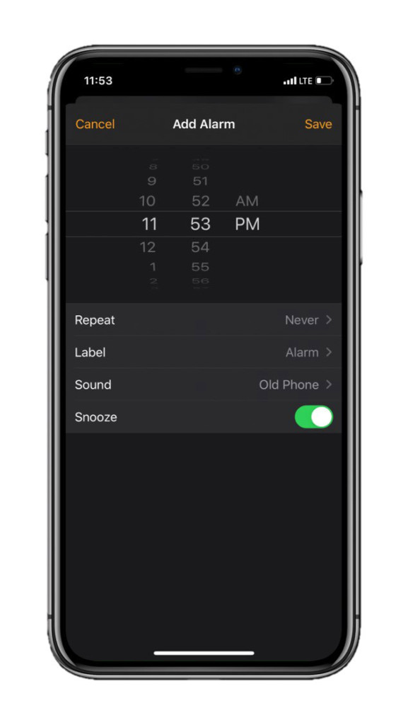
The current iOS alarm interface gets you scrolling on an accordion of numbers until you set the combination poised to wake you up on drowsy mornings. It’s an excruciatingly rambling process.
And no matter how realistic the syncing of speaker sounds and the clicks produced by the Taptic engine on your iPhone make the time-scrolling interface feel, Apple needs to fix it for ease-of-use.
Moreover, this isn’t just a minor inconvenience; I perceive it as a roadblock since the current interface discourages me from creating new alarms when I’m too lazy to even knock the socks off my feet.
Now there are many ways Apple could do this. Maybe it could create an entirely new interface, walking along the lines of Apple’s legacy of doing things out of the box. Or maybe; just maybe, it could copy certain alarm clock setting designs from Android.
Link to a particular app’s settings from the app itself.
Stock apps on iOS have their settings tucked into the Settings app. So, the process gets unnecessarily complicated and time-consuming when you need to access a certain app’s settings quickly.
For example, if I need to change the default sorting of notes in the iOS Notes app, I have to exit the Notes app first and head over to Settings. There, scroll down until I find the settings panel for Notes and tap on it to change anything further.
I know it might may be a little too much to ask for a dedicated settings panel for the corresponding stock iOS app within the app itself. But Apple could at least provide a quick link to the app’s settings in there.
This will save a lot of time. However, this isn’t something that I’m hellbent on requesting Apple to do, but it could be a nice improvement after all.
Add better video controls in the TV app
Apple’s TV app offers decent entertainment with TV+ shows and originals. However, the player that the company offers to view those shows is at the most naive. It’s a simple interface that is native to iOS’ design. And it doesn’t match the purpose of the content that Apple offers in its TV app.
For a company that chooses user experience over mere content delivery, Apple has been too liberal with its Apple TV+ service.
Features like thumbnail scrubbing and brightness controls do not exist in Apple’s video controls. I get it if Apple doesn’t want to adopt these features natively, but why doesn’t Apple TV+ have them? Even though I pay for the service.
Other streaming apps like Netflix and Amazon Prime Video offer advanced video controls which make the streaming experience all the more pleasant. Moreover, Apple adding advanced video player controls in the Apple TV app on iPhone and iPad may finally push it further into the field of video streaming apps.
Add a dedicated Apple TV+ tab in the TV app on iPhone and iPad.
Yet another caveat with Apple TV+ is that it’s tough to navigate to the service in the TV app on iPhones and iPads. No dedicated tab exists and TV+ shows are pitched along with iTunes movies and buyable shows on the home page within the app, making it difficult to distinguish between them.
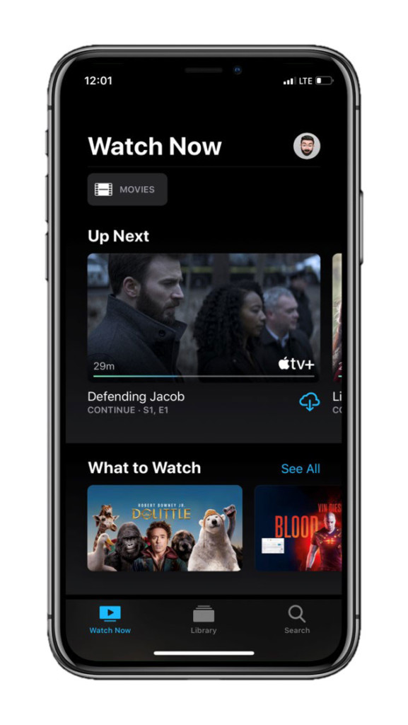
It gets quite confusing sometimes, and the overall experience of reaching to your beloved Apple original is not easy. Apple could simply introduce a dedicated TV+ tab in the app to fix this inconvenience. Moreover, this, too, could further reinforce Apple’s stance in the realm of streaming apps.
I can’t comprehend how Apple hasn’t considered such measures already. For a company that chooses user experience over mere content delivery, Apple has been too liberal with its Apple TV+ service.
An ‘Always-on’ display, maybe?
I know this is a lot to ask. Implementing an always-on display comes with a bunch of implications—battery, display type, UI, etc. As the display stays on at all times, it has to be OLED to put much less strain on the battery.
And I’m sure there are reasons behind Apple’s obscurity towards always-on displays even though OLED iPhones could easily support them without putting a lot of strain on the battery. Maybe optimization is difficult. Maybe the demand for this feature is low and “niched.”
Whatever may be the case, I think Apple has everything lined up in terms of hardware to introduce this feature. All it has to do is drop it onto iPhones with the next update.
Conclusion
iOS 14 has been leaked pretty extensively already. So, the chances of Apple even considering these changes are low. The new iteration of iOS is rumored to reveal a ton of new features including a dedicated Augmented Reality app, a feature for using apps without requiring to fully download the app, new wallpaper settings, home screen customizations, and much more.
With every major iOS release, Apple also introduces many features that tend to slip under the radar. And even though those updates are minimal, they sometimes prove to be a big deal for a lot of users.
Nevertheless, these were the suggestions I had for Apple to include in iOS 14. I’m sure there may be a lot of other things that need fixing but haven’t caught my eye yet. If you have something that you think iOS 14 could improve, let me know in the comments below and I’ll mention your suggestions in this post with due credits.
Update: This article was updated to rectify information about push notifications in the iOS mail app.
Note: This story contains affiliate links that may earn me commissions on successful purchases to help keep the site running.
Further reading:
Check out the best Siri Shortcuts you can get on an iPhone!
I’m not kidding! Here’s how you can earn money just by receiving emails.
How to get more iCloud storage on iPhone, iPad, and Windows
The ultimate guide to backing up your iPhone, iPad, and iPod
Apple reportedly working on a foldable iPhone, according to Jon Prosser
