There are a ton of travel journaling apps out there, but none wins and fails simultaneously at journaling travel other than Journi. But the real question here is what matters to you? Is it winning, or is it failing?
Simply speaking, Journi brings your travel experience into perspective. It pleases you, and at the same time does not fail to disappoint.
Maintaining a travel journal throughout my trips, from boarding the first flight to departing the last, usually bores me to the core. However, Journi Blog makes it a bit more interesting. That doesn’t necessarily mean it has made it any easier. Even though all you ever have to do is pick up your phone and get on to typing, tagging, and inserting images.
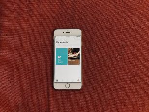
Journi does not have a highly compelling landing screen, to begin with. It feels like a mixture of iOS 11’s huge titles and Pinterest’s card-like appearance. The concept may sound good. But in practice, it doesn’t invite you to de facto begin writing.
However, the main screen doesn’t matter much, since what’s inside that counts. But that isn’t refined either.
At the core of the process, you just have to create a journey and constantly update your travel progress. It’s like posting updates on Facebook and Twitter, except the app is specifically designed and revolves around travel aficionados. So, at least, you can be assured that your entries can be much more visible since there is a viable audience looking for it.
While creating a new “Journi”, the app asked me if I wanted to keep it private or share it socially. Turns out, choosing the private option wasn’t bad. That is because Journi Blog allowed me to choose people who I’d like to share my journey with instead of completely confining it to myself. But what got me surprised is the collaboration feature. Friends on a trip can share a journey feed and update it. Think of it as posting updates on someone’s Facebook wall.
On a more social level, people who have their journeys set to open, compete to create the most appealing travel journal; partly by adding alluring cover images. The app then features them on the discovery page. Further, the app allows anyone to comment on your journey, provided it’s open for all. Reactive emojis (just like in Facebook), additionally make responding easy and intuitive.
Tapping into a journey, however, is when the experience kicks in. Which is mostly fun and to a substantial extent, disappointing.
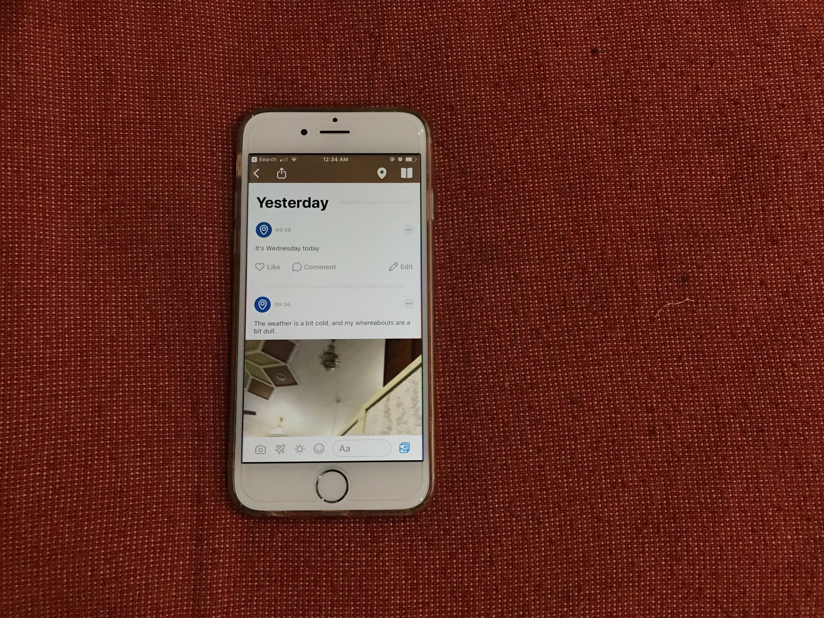
First, you are hailed with a featured image of the journey, that of course, you have to choose. Then the app automatically finds out your location and pins it to a map. Each time you post an update to your journey, the map adds a pin to your location. What particularly annoys me with the mapping system is that you cannot manually add a pin. So if you are out of sufficient network connectivity or if you simply lose GPS, you miss out on adding a location to your update.
Further down, there are two things-disappointment and annoyances; more than anything. First, the disappointing part. The update stream is poorly designed for a travel journal. It seems to me as if its appearance is identical to a Facebook feed with a few enhancements. Even the emojis you add look like the ones you use on Facebook. But that’s not a problem. If you post on Facebook, you shouldn’t have a problem with posting on Journi Blog.
But, it’s a critical design aspect that could prove lethal for this app. A journal; especially a travel journal, must have enthralling visuals to make reading about the travel amusing. By enthralling visuals, I point towards outlined, huge image layouts and bolder text. Instead, the app opts for a simplistic approach, without even approaching simplicity. And it’s the wrong kind of approach. The date of the description, for instance, is in a bolder font than the description itself. Which makes it difficult at times for me to read the entire journey.
Now, let’s talk about the annoyance. There’s just one, but it’s major. The arrangement of the field is chronological. But in reverse. So, if you want to read someone’s journey, you’ll have to endlessly scroll down to see the starting point. Why would you want to do that? Why would you want to read a travel diary from the end so much that Journi Blog developers had to implement a reverse-chronological feed in the first place?
I wouldn’t call these annoyances; annoyances. They are attributed to careless decisions, in my opinion. Although, not everything in the feed is hellish.
You can, apart from regular photo/text updates, add your flight trips and weather information of the place you visit, which is an improvement over everything. The flight details essentially act as an indication for a transition from one place to another. It’s not mandatory, however, to add them.
The one thing that exceedingly amuses me is that the app shows immigration-like stamps when you transition from one country to another. Those are like real immigration stamps that are stamped in your feed at points of transition. They, if not anything, add value to the feed, giving it the enthralling factor I was talking about earlier in this post.
Another great feature Journi Blog has, is its ability to virtually add photos from particularly every important social media account in an instant. It pairs with Facebook, Instagram, Google Photos, and your default camera roll to import photos with the snap of a finger.
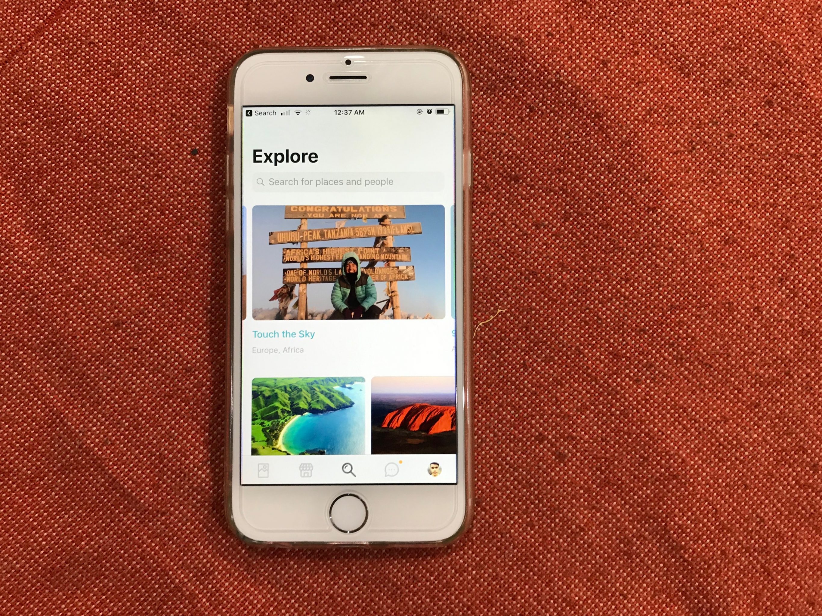
The explore tab offers a great deal of activity, with constant updates from users. To be true, the cover images in the explore tab genuinely force my brain to go have a vacation and post updates myself to the app. But I can’t, unfortunately, have a vacation.
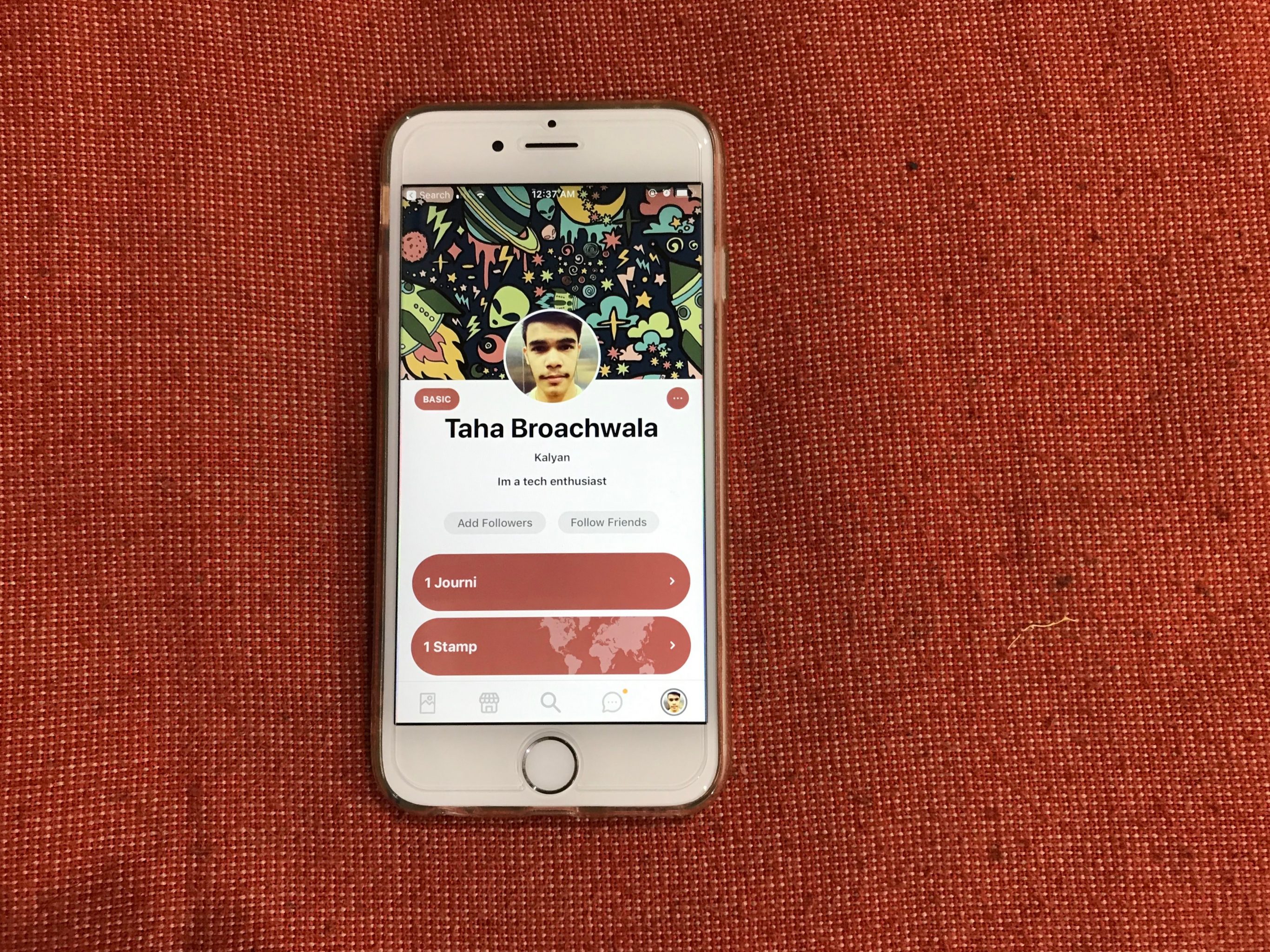
And since this app is part social, it has a separate notification tab that notifies you if someone follows, comments, or reacts to your journeys. Also, it has a simple, yet elegant profile page. You can add a description, view your journeys, and see the stamps you’ve collected.
Now, I want you to keep everything I talked about on one side and what I’m about to speak on the other.
Journi Blog has a commercial aspect to it, which is fairly elegant. Aside from creating a virtual journal on your phone that lives on the cloud, you can also have it printed in a physical one. One that’s far more visually appealing than the digital version. Physical options, though, include a photo book, a calendar, and a Polaroid box.
This is touching, especially due to its tangible value. Things you can feel often condescend upon the things you can just see and tap upon. Besides, gifting a physical journal to someone sounds more sensible to me, no matter to what extent I’m invested in technology.
Conclusion
Journi’s winning and failing question have more weight on the failing side. A few design elements overjoy the mind, while some features overtax the brain. Good thing, it isn’t a complicated mess. The explore and the profile tab are good additions. The physical sharing options that add a human touch vent for sheer diligence.
But, at the end of the day, if you like the app or not depends on what you want to use it for. If you want a stylish, well-designed Polaroid set, photo album, or a calendar; this app is probably the best for you. But, if you want to just document your journey and save it as a future memory in the cloud, this app wouldn’t be the best bet.
All-in-all, it’s better than the other apps out there and is available on both Android and iOS as a free download.
